en
en 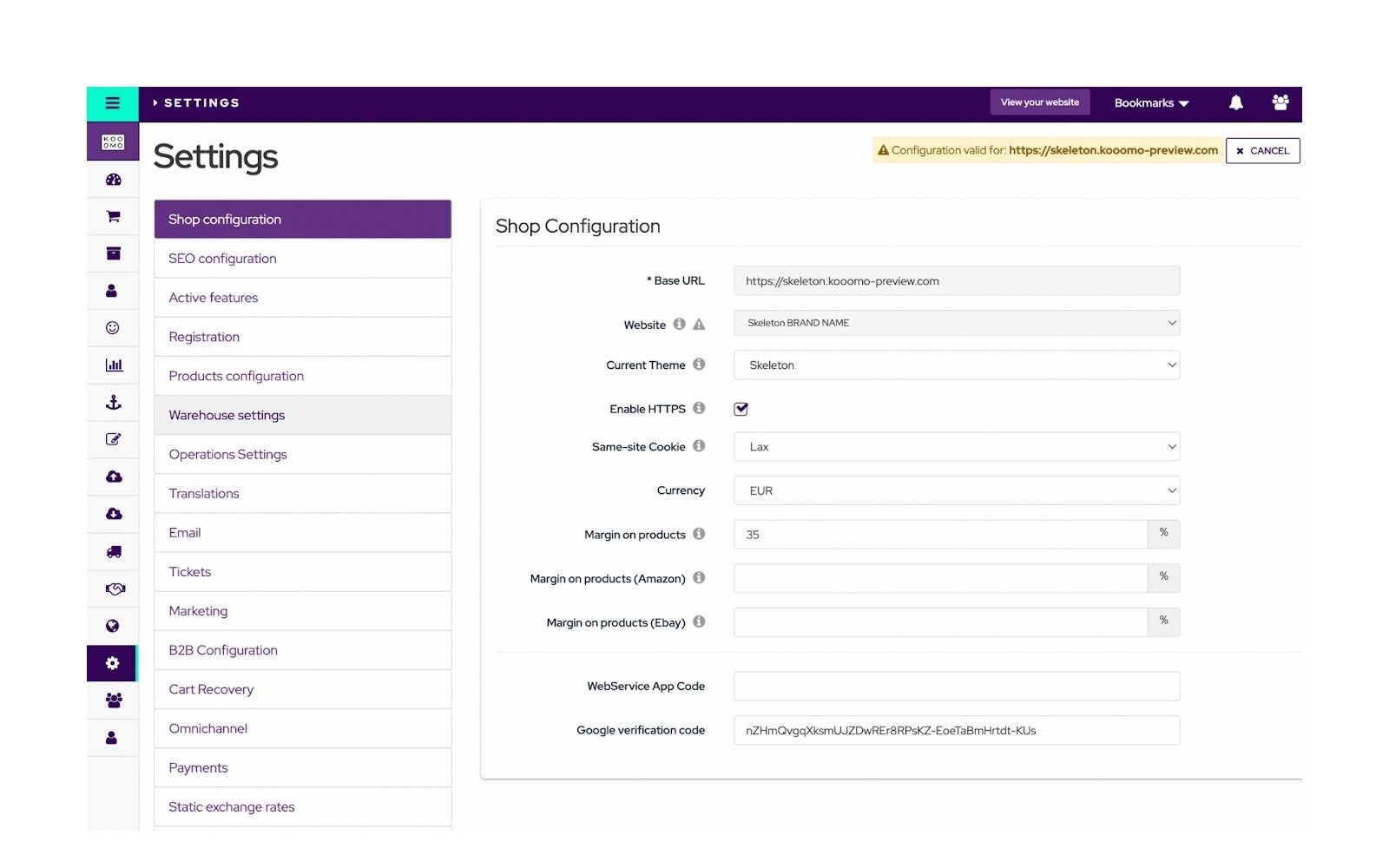
>Share this post<
by Irina Ciutaco
May 27, 2022
How is the Kooomo brand communicated to its users?
How do the new improvements enhance the overall User Experience?
All the improvements made in the Kooomo platform user interface are managed at the same time as the enhancements of the user experience. The modifications which were applied, provide support to the users in the main navigation and usage of the platform. The purpose of these improvements is to increase its overall usability, by providing a consistent, predictable and meaningful tool. Furthermore, this is a more pleasant experience for users and causes less friction, confusion and frustration.
Consistent, Predictable and Meaningful
These three words come into mind when speaking about building a successful User Interface. On one hand, consistency is the key attribute in portraying a serious image for the entire Kooomo admin panel. Users are more likely to notice a serious image for the whole panel, by becoming aware of this aspect. Thanks to its consistency, the usability of the platform becomes predictable.
Last, but not least is the meaningful aspect, which shapes the idea that there is a logical reason behind every design decision. Layout, sizing and spacing decisions all have thought and reasoning behind them.
Treating the Admin Panel as a Tool
In UX design, the unique behaviour of the user interface is imperative. It is a working tool, and colours chosen are representative of the actions that are possible, they are signals to help guide us on the journey.What changed
Main Navigation Elements
Typography
Kooomo has elevated our font family. Mostly, this is an indication of the fact that it is a Kooomo product. A clear type scale was created, with the purpose to build a structure for all text in the admin panel. This enforced the idea of hierarchy and clean readability in the platform.
Buttons/ Dropdowns/ Tabs/Pills
Significant changes were made to these elements, which are built-in Bootstrap 3 design systems. Having adapted the Kooomo global admin panel colour palette, we also worked with the saturation of the Bootstrap default colours. This kept with the consistency we are striving for throughout the admin panel.
We have changed to these elements so that we provide a more modern and updated user interface. The fixes can be seen in spacing, size and shape.
As an essential part of the admin panel, all the form elements have been refined and adapted to the new user interface. Input selects, checkboxes and radio buttons were modified, depending on the state found on the platform.
Fixes were made to the tables in terms of spacing, shape, hierarchy and colours. All the different table assortments have been considered to apply design solutions that would fit all modern requirements.
Adding the correct spacing to enhance readability
With the applied changes, we have improved readability by separating the main content from the global navigation elements. We have added 'air' to it and reinforced the visual hierarchy blocks information within.
Bringing consistency to table actions
By introducing UI consistency to all table actions, their UX is therefore elevated. Furthermore, the dropdown list format offers a more flexible way of adding or removing actions affecting a table row, without compromising the UX or the table’s layout in the future.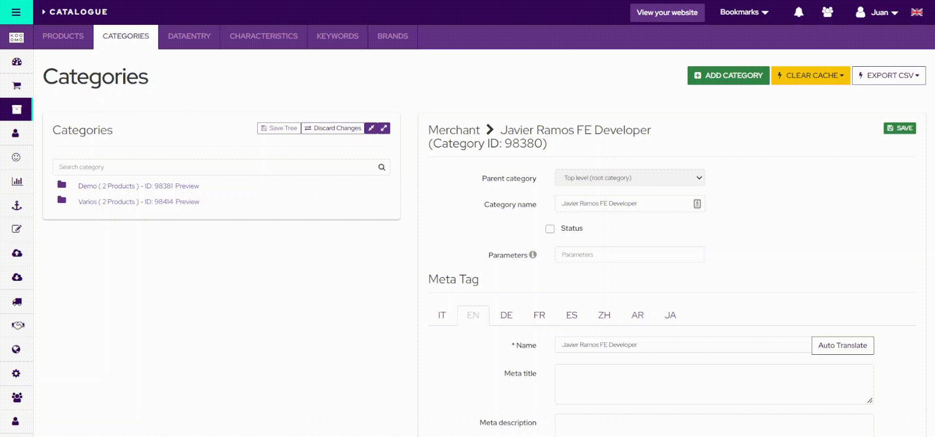
The title always has to be the element with the most significant hierarchy, not only in size but also in its location. Occidental users read following an imaginary 'Z', from the top left to the bottom right. Therefore, all titles have been fixed and now remain at the top left corner of the page.
Elevating navigation in the platform
Kooomo’s admin panel has advanced and upgraded in terms of layout, consistency and an overall better user experience. Our aim for 2022 is to continue to elevate and raise the bar to support our users with our sharper eCommerce platform. This is just the beginning, don’t hesitate, discover it on Wednesday 20th of July!
More to explore

eCommerce Essentials
Here’s an overview of the latest improvements that are now available in the Kooomo platform.

eCommerce Essentials
In the next few years, we are foreseeing an impressive increase for the global retail industry. While this can be beneficial for the global eCommerce industry, it also means that there will be more competition, as well.